When you strip it down, the purpose of buttons is to promote an idea or a business or an organization. So let’s show a little respect for some shameless promotional buttons. Below are a collection of 10 pinback buttons created for the sole purpose of promoting a business or an event.
1. TriRail Downtown
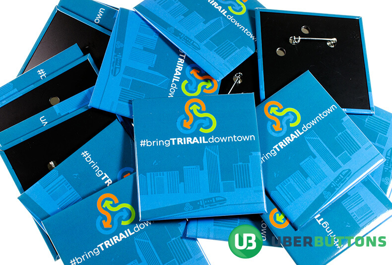
The first on this list is a button promoting a campaign called #BringTriRailDowntown. The simple design conveys a lot of meaning. The main elements are the monorail and skyline in the background, the campaign hashtag and the campaign logo comprised of three curved arrows. There is nothing to detract from the simple message – bring the monorail to downtown.
2. I Made An Impact Promotional Buttons
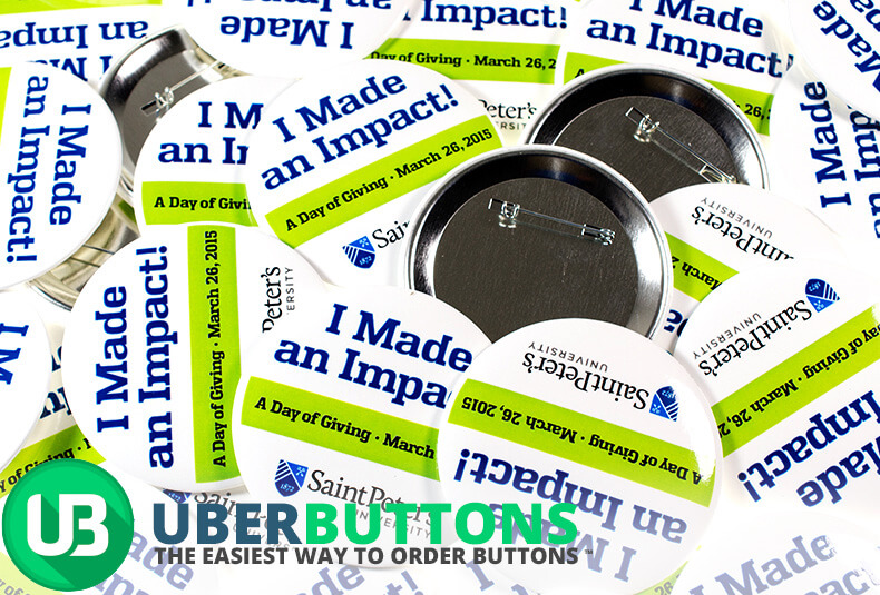
Secondly, we have the St. Peter’s University, “I Made An Impact” promotional buttons. This button, in contrast to the previous one, uses all of its space to cram in the most text as possible. It features the tagline, the date, and the university’s logo.
3. Urbanite Theatre 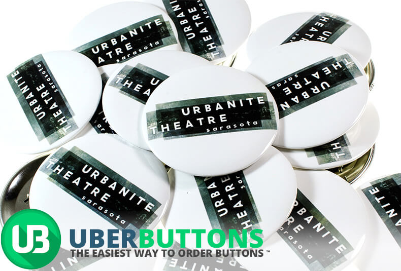
Next up we have the third button on this list. A bold and sparse design emphasizes this theatre’s logo. It is fitting that a theatre, an open space meant to be easily transformed into whatever the script calls for, would adopt such a stark logo. The emphasis should not be on the space in which the play or piece is being performed, but rather the performance itself.
4. The Sharing Place 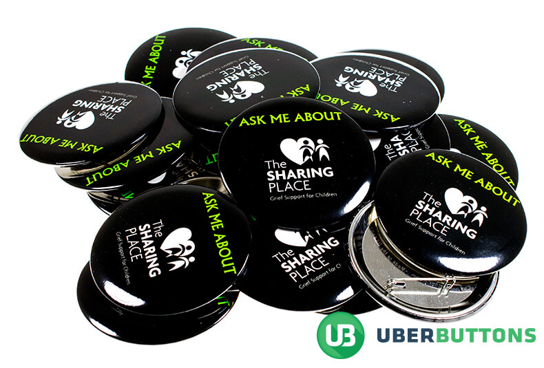
The next promotional buttons feature The Sharing Place, an organization for giving children grief support. The design of this is pretty brilliant – the black background symbolizing the grief that comes along with loss, and the white logo representing a light at the end of the tunnel, or a beacon in the midst of emotional pain.
5. Atheists of YSU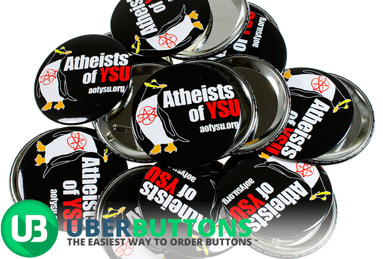
This button, advertising a local Atheist group leans heavily on its little penguin mascot and the bold, red and white text. This button can be read from a ways away due to its bold color choices. Ultimately, this is a very effective button.
6. Corvette Diner Swag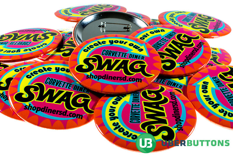
We love this groovy button! The bright and eye-catching colors that this button adopts quickly draw the eye to the easy-to-read text. This button promotes a deal at a diner, which means servers wear it on their aprons or their uniform shirts. The bold color choices ensure that patrons of the diner are able to easily see it and read it.
7. Be An Online SLP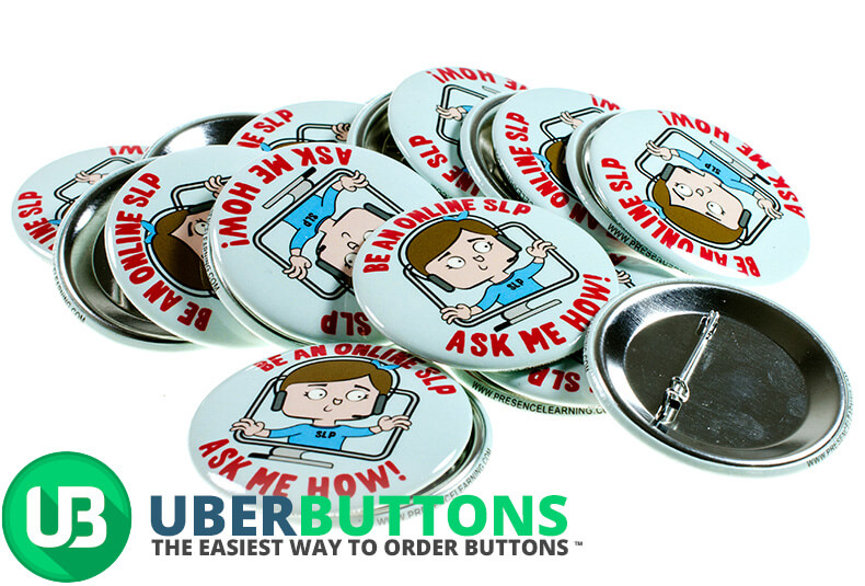
This button features a simple cartoon design advertising a new career as an Online Speech Language Pathologist. The cartoon character climbing out of the computer screen adds a nice touch. It could help to engage the person looking at the button. The font on the button is accessible and easy to read.
8. Healthy Me, Healthy We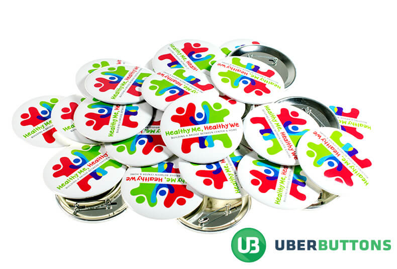
Healthy Me, Healthy We feature a really cute logo that fits perfectly with the campaign’s cause. Teach children about nutrition and healthy habits by leading by example. The simplistic design of the button highlights the text on the bright white background.
9. #LiveNoble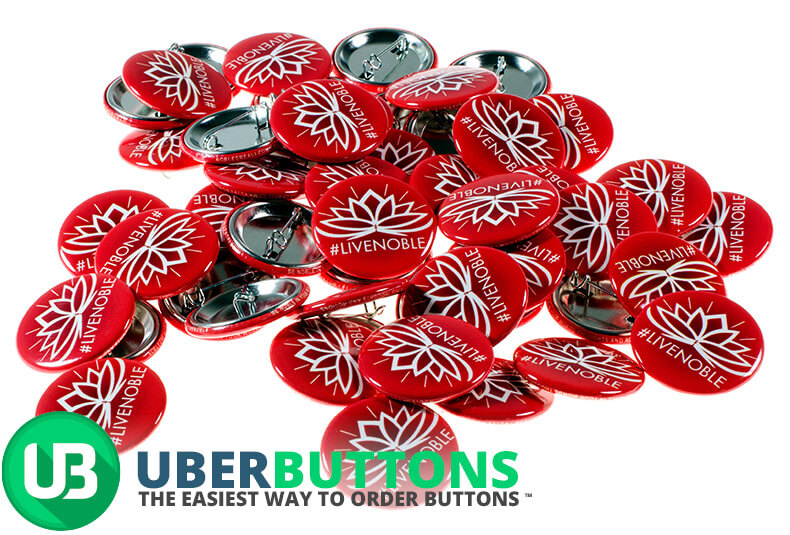
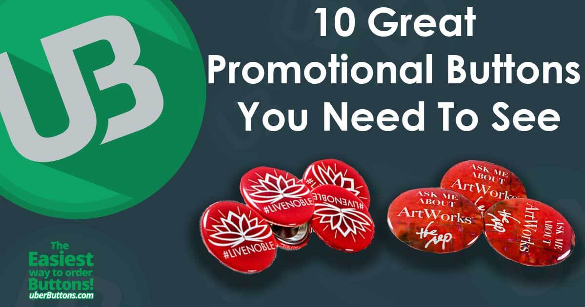
This button packs a punch while incorporating only a few key elements. The Lotus logo draws the eye to the center and the clever color gradient adds so much to what could have been a very flat looking button. By saying very little, the hashtag says so much.
10. Ask Me About ArtWorks
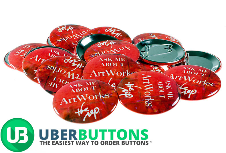
This 3” button has a very alluring color palette and wastes no time in emphasizing it’s text. With nothing to distract the eye from the meat of the message, this is a very effective button for advertising ArtWorks.
This list of 10 buttons highlights the many ways promotional buttons can be used to have the desired effect while remaining artful and beautiful to look at. Get started making yours on our site.

