We at UberButtons know that designing a custom buttons logo takes a lot of skill. From deciding the color scheme to arranging all the elements, sometimes it can be a little overwhelming. Putting together all of the elements of design in a harmonious way is a huge challenge. To help prevent a case of analysis paralysis, below is a list we compiled of all the key design elements needed to create the button of your dreams!
1. Eliminate The Clutter

When it comes to design, less is more! You have very little space to get a message across, and you don’t want that space to be hindered by elements of custom buttons design that have nothing to do with the logo. Make sure that every element of your design, from the color scheme to the font choice has meaning. Don’t let clutter confuse your brand’s message.
2. Carefully Choose Your Custom Buttons Colors

There’s nothing worse than matching colors that are too similar. The color wheel is an essential part of the design. Colors should contrast each other and correspond to your brand’s color story. Remember that your logo or design is the window to your company and it should properly reflect and represent your values. “Cool Toned” colors, like muted blues, greens and greys often contrast very well with bright “Warm Toned” colors like orange, yellow, red, purple.
Not only do they contrast well visually, but they also have certain connotations. Blue is a more passive color, if your company or organization promotes activity, you may want to go with a brighter, warmer color like red or orange.
3. Photo Quality is Key
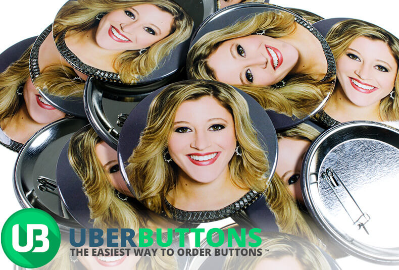
If your design includes a photo, it is super important that the photo be of good quality! Make sure that the lighting is good and the pixel count is 300 dpi. Many times the photos we receive are very low quality, and in order to size and shape them to fit on a button we end up fighting with badly pixelated images. Be sure that the photo you wish to use is one your organization or company will be proud of.
4. Take Advantage of White Space
![]()
Like we said above, less is more and that applies when it comes to using white space in your button. White space draws the reader’s eye to the design and keeps your button looking tidy. Consider the white space a part of the design itself.
5. Face Up To The Font
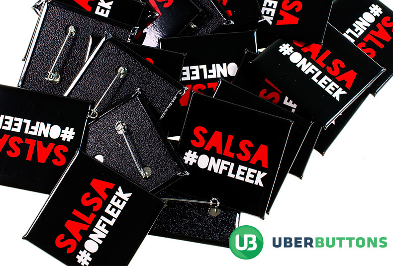
Big, bold, readable fonts are your best bet when creating buttons. Using a thin, script font on a promotional button is not a good idea, because it makes it tough for the audience to read the button. Then again, if your design is supposed to be whimsical, maybe the font should be more cursive – in that case, your design must feature a photo or image to draw the eye.
If you follow these steps your button design should be good to go in no time. Create your custom buttons with us, here.